A dual-theme token system for an internal insights platform
Making theme and breakpoint a single variable change
Overview
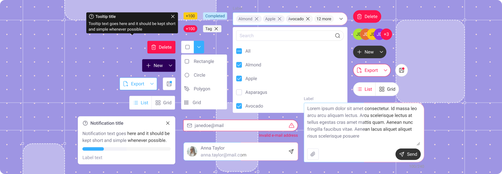
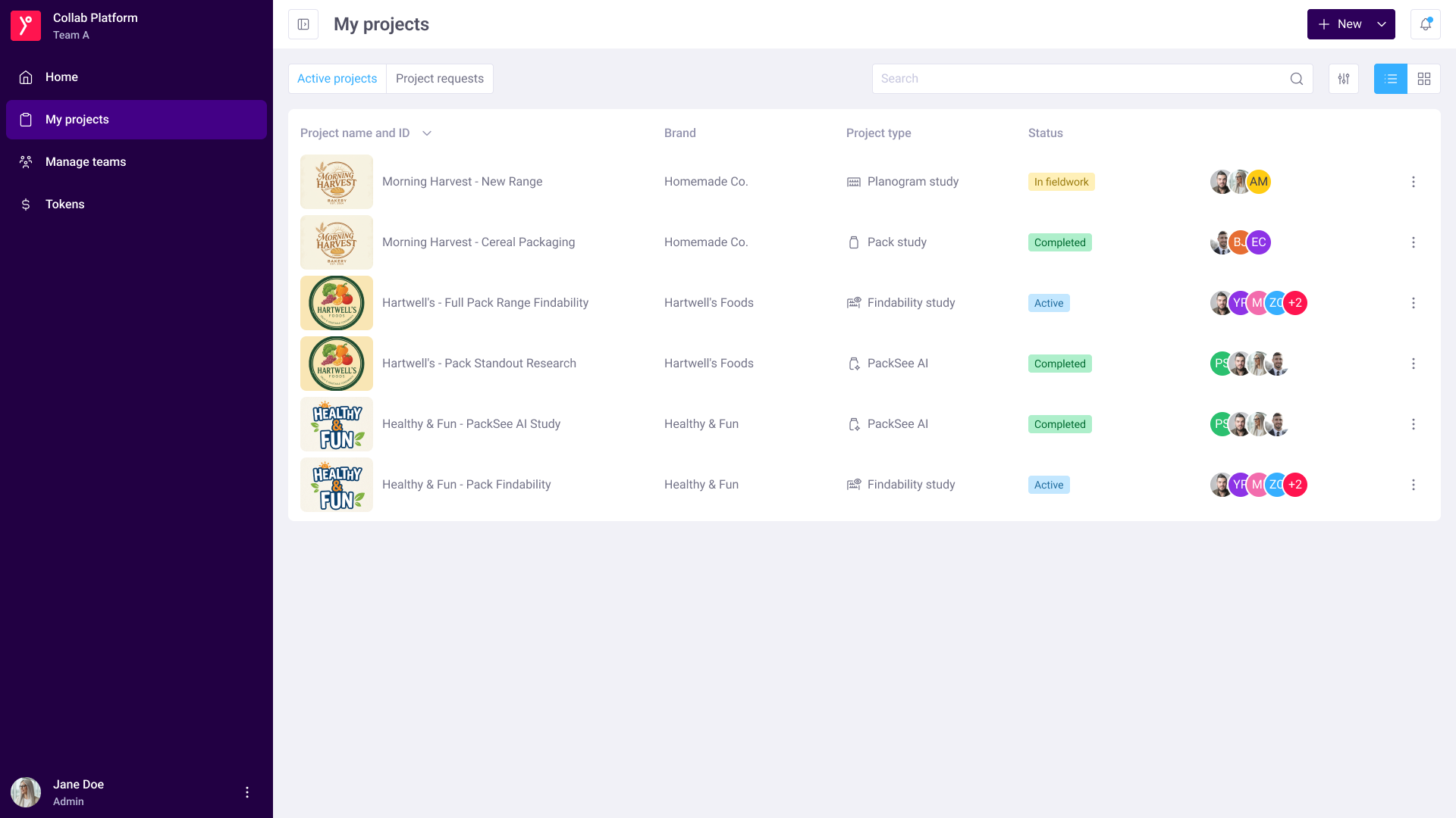
Collab platform has two sides: an internal platform used by insights managers to set up projects, and a client facing platform where clients can view projects they are working on and access some DIY features. They are two sides of the same product, but visually they do not seem that way.
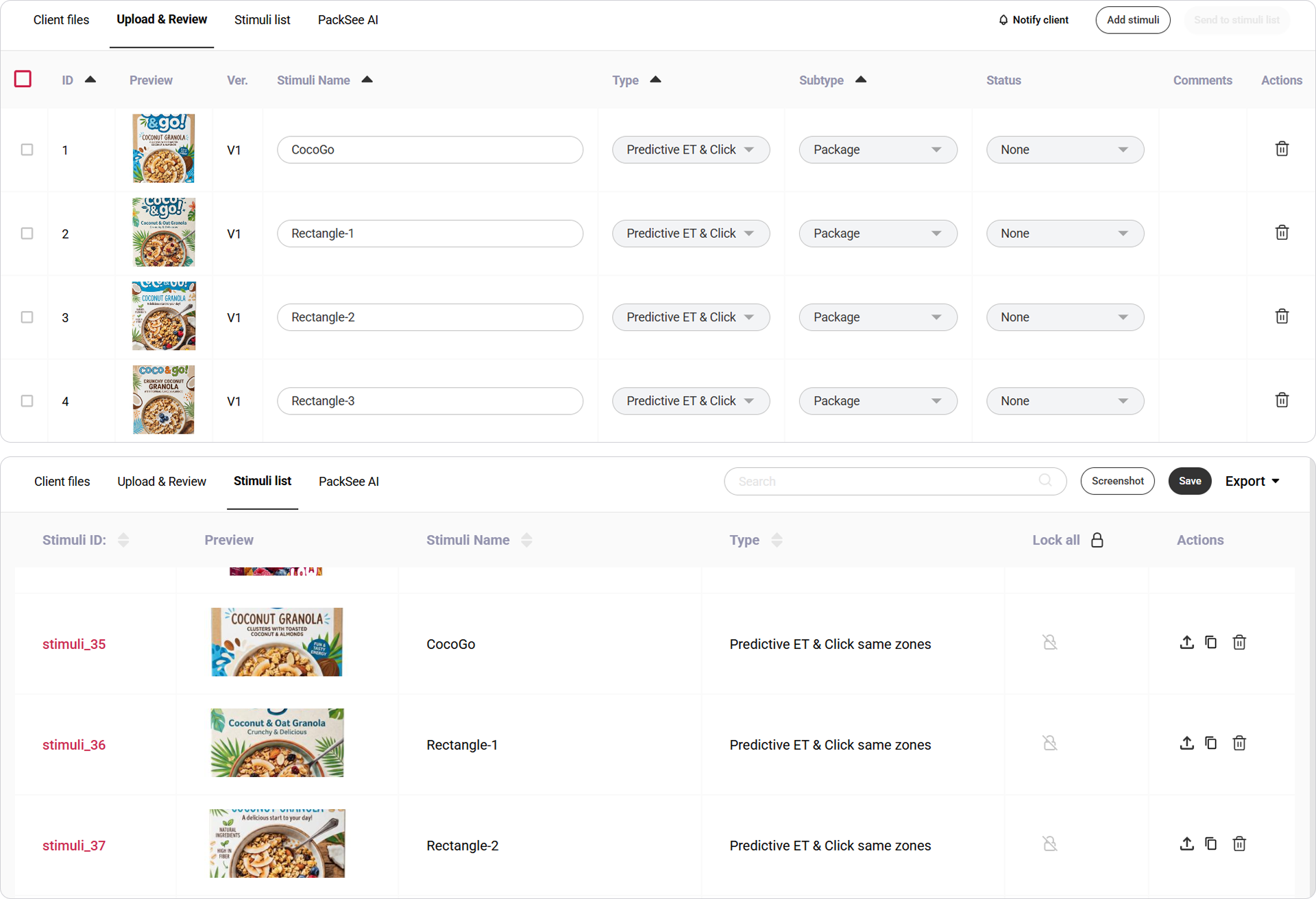
The existing internal platform files were outdated, had no auto layout, no shared components, and used raw hex codes throughout, which made nothing reusable even as a starting point. Having one feature developed often for both internal platform and external platform meant the same work had to be done 4 times, 2 times for each platform, and 2 times for each breakpoint. With ongoing initiatives to redesign parts of the platform, the workload reached a point where I often had to leave placeholder shapes in sections I could not fully mock in time.
Audit
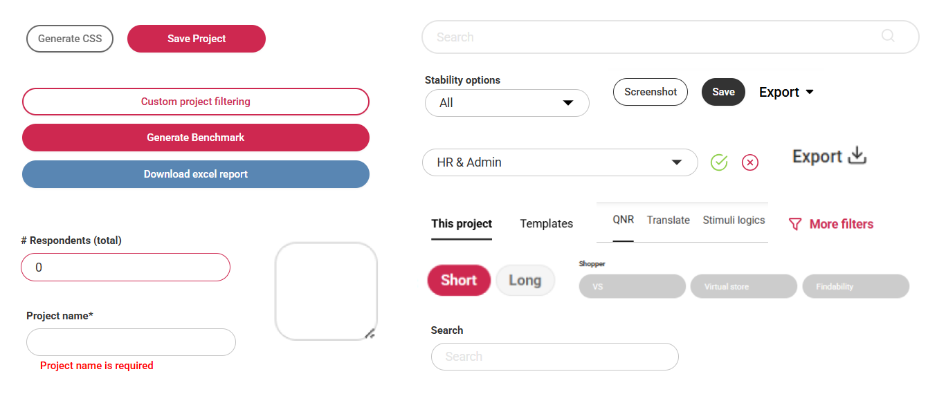
I performed an audit of the platform to see the extent of the issue, and how to best approach it. The internal platform was built over several years by multiple teams, often without design guidelines and under pressure to release new features. Components were reused from earlier tools and modified as needed, which produced a platform full of inconsistencies: multiple table variants, many button variants implemented without any particular rule in mind, and other small inconsistencies. The client platform, by contrast, already had a proper design system that I built a few years earlier and maintained regularly.
The simple solution, upgrading the existing design system to support two brands where shared components receive different brand colors per platform, was not going to work here. The two platforms differ in ways that go beyond this.
The first difference is the neutral palette. The client platform uses a tinted gray, while the internal platform uses a true gray palette. Swapping primary colors alone would not produce the correct visual mood on either side, so the internal theme could not be treated as the client theme with the brand color removed.
The second is the role of red. The client platform has a full color system including primary, secondary, success, warning, error, and accents. The internal platform uses red as its only consistently applied color, and it carries two meanings simultaneously: the brand color and the error color. This created a semantic tension that had to be taken into account.
The third is the corner radius. The client platform uses sharper, more squared buttons and inputs, while the internal platform uses rounded ones. This difference has a noticeable effect on perceived brand identity even when colors are set in place.
Typography was one of the simpler aspects. Both platforms already used Roboto at similar sizes, so text could remain visually consistent across themes. This allowed the theme-switching work to focus on color, neutrals, and radius, which is where the platforms actually diverge.
Design
The system uses four token layers in Figma. Each layer handles a specific set of decisions.
Core
Raw core values carry no semantic meaning on their own. The color section consists of hex values organized by palette, and the client platform already had these defined. One additional core palette was added for the internal platform so it could have its own true neutral without affecting the existing tinted neutral.
Core also holds non-color primitives: font family, font weight, and a numeric scale that ranges from smaller values used for border widths up to larger increments used for spacing, typography, and component sizing. Everything above Core references these primitives instead of hardcoded values.
Alias
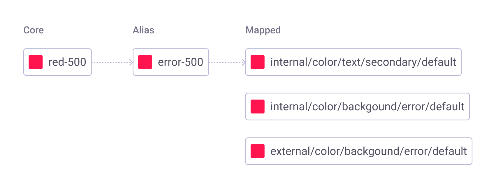
This layer contains semantic names: Primary, Secondary, Error, Success, Warning, a set of accent colors used for charts and data visualization, and both a Cold neutral and a True neutral so that both platforms can share the Alias layer while referencing from different cores. Red appears at this level only once, as Error. Even though it also carries brand meaning on the internal platform, creating a second alias for the same color would have been redundant, and the actual split between brand role and error role happens one layer up at Mapped.
Mapped
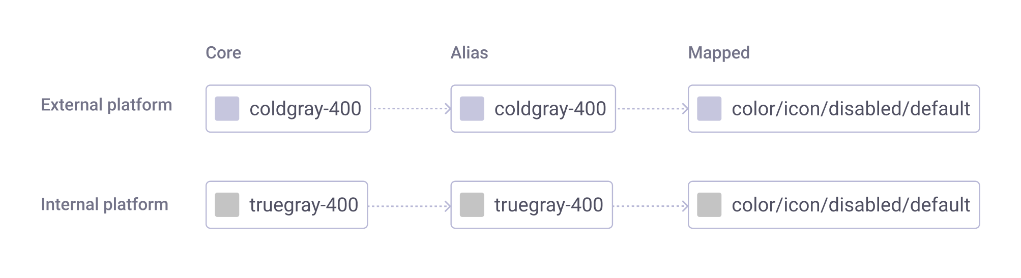
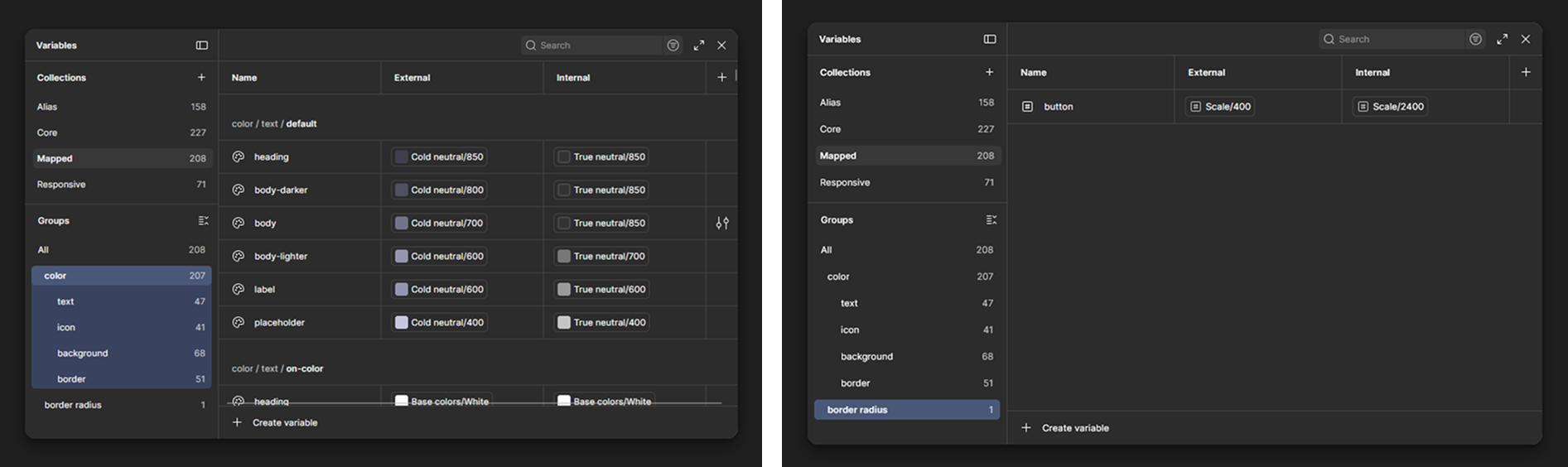
This is the layer that actually enables the dual theme. Mapped tokens describe where color appears in the UI: text, icon, background, and border. Each mapped token holds two values, one for External and one for Internal. For example, color/text/default/heading resolves to Cold neutral 850 on External and True neutral 850 on Internal. The semantic role is identical, but the visual output is brand-appropriate on each side. Switching a Figma component from one theme to the other becomes a single variable change.
This is also the layer where red's dual role is resolved on the internal platform. The same Error alias is routed into different slots with different tint strengths depending on what it is communicating. Stronger, more saturated tints, paired with a warning icon or other indicator, are used for error states. Softer, less saturated tints are used for brand accents such as selection borders and backgrounds, and lozenges. Separating the two by tint strength and visual indicators keeps the brand presence intact and creates enough visual distance for the error state to still read as an error.
Border radius is also defined at the mapped layer as a single token. It applies to buttons, input fields, and dropdowns, which are the elements where the two platforms actually differ in shape: External uses a 4px radius, while Internal uses fully rounded corners. Cards and modals use the same radius on both platforms and did not need a separate mapped token. Including radius in the theme swap is what made the switch feel complete.
Responsive
The platform is a web based app used on company laptops and external monitors, not tablets or phones. The available space still varies widely, from a 13 inch laptop at 150% display scaling up to a large 2K monitor, and elements sized for the bigger screens become oversized and crowd the layout on the smaller ones.
Until this point there was never time to design for responsiveness up front, so developers handled it on their own. Screens were sometimes missed, important elements ended up cut off or out of view, and we kept getting requests to go back and fix pages after they were already in production.
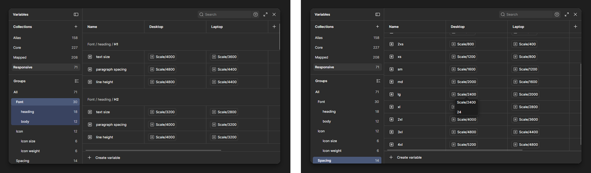
To address this at the source, I added a separate collection for values that scale between larger and smaller interface sizes: typography sizes, line heights, icon sizes and weights, and spacing. Every value references a Core scale, so all scaling decisions come from one source.
The scaling approach uses two rules depending on the element.
For tokenized values, each laptop token is one step smaller on the Scale than its desktop counterpart, which typically translates to a 4px reduction at most sizes and smaller reductions for values where 4px would be too large.
For larger non-tokenized layout elements such as sidebar widths or container heights, I applied a 25% reduction, calculated mathematically. A 400px sidebar becomes 320px, which gives proportions that feel natural at the laptop breakpoint. The 25% rule held up consistently for larger areas, but was adjusted case by case where it produced awkward proportions.
Components
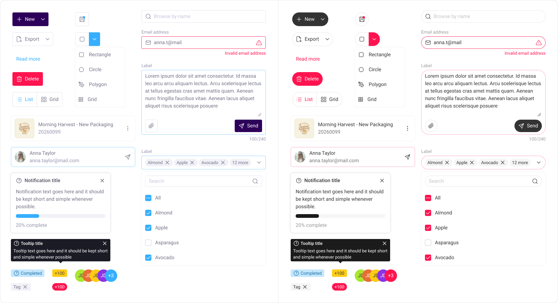
Having components used on external platforms and tokens set in place, the next step was to combine the two to create a design system that will be used on all projects related to the internal platform.
In an attempt to unify two platforms visually, it was important to keep components as similar to each other as possible. To do that, components used for the external platform design system were changed using the token system when possible. Where the needs on the internal platform surpassed those of the existing external system, I upgraded the external component first, and then translated it using the token system.
Navigation was the only element that differed significantly between the two, so the custom navigation bar was created for the internal platform only.
Implementation
Designing the system in Figma was only one half of the project. The other half was defining how it would reach the platform, given that the dev and QA teams could not pause feature work to work specifically on the design system.
To solve this, together with the PO, FE, and QA teams we agreed on an incremental approach. New components are built in the new system first. When a new feature is added to a page, the old components on that page are swapped for new ones. Because the components are token-based, later theme or scale updates do not require editing every file. This prevents sudden visual changes for users, avoids a large dedicated migration window, and lets the system spread through the platform naturally. It also changes how components are verified once they are in place: spacing, sizing, and typography are carried by tokens, so QA confirms the correct token is applied instead of measuring each value.
Outcome
The foundation is in place: core, alias, mapped, and responsive tokens are defined, the main components are rebuilt, and a handover with PO, dev, and QA is underway to set up a Storybook where components can be tested before reaching the platform.
The clearest impact is on production time. A feature that targets both platforms across both breakpoints used to require four separate builds. Now I build the most complex version once, then produce the rest by swapping tokens: theme tokens change the design from external to internal, breakpoint tokens change it from larger to smaller breakpoints, and I adjust details only where needed. That is roughly a 2x saving when a feature targets a single platform, and up to 4x when it is built for both platforms and both breakpoints. I haven't tracked this in hours, but now the feature needs to be designed only once.
Because the components are token-based, FE devs no longer have to work on different breakpoints separately, and QA no longer re-checks spacing, padding, and font sizes on each instance. They verify that the correct token is applied, which significantly narrowed their testing scope on components built in the new system.
What became visible over time is that in certain situations a simple primary color swap didn't produce the desired effect on the internal platform, so variants had to be updated to accommodate for a realistic scenario, instead of just swapping two primary colors.